UI/UX
Feature
Cocoa website
Feb 16, 2025
Background
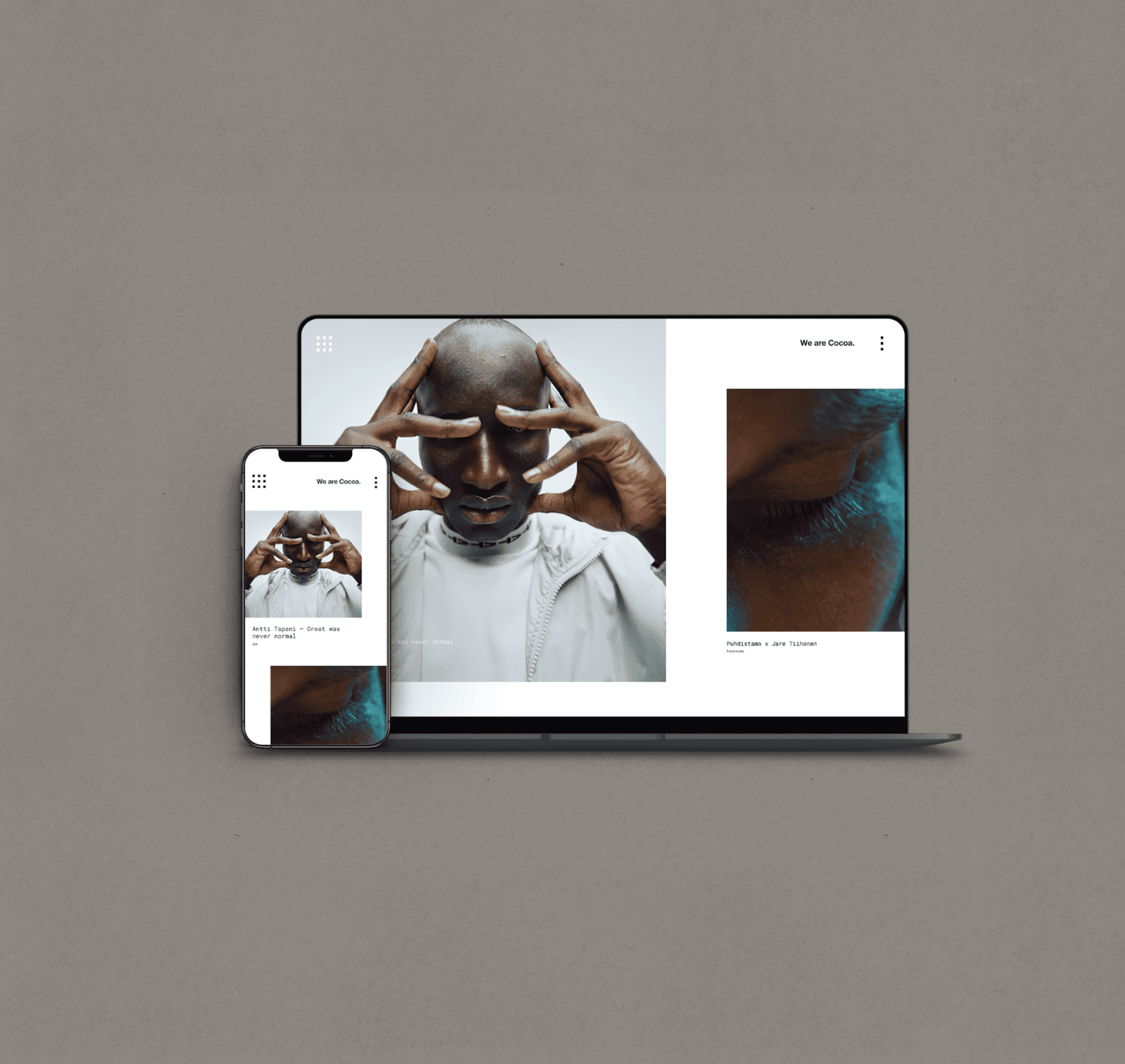
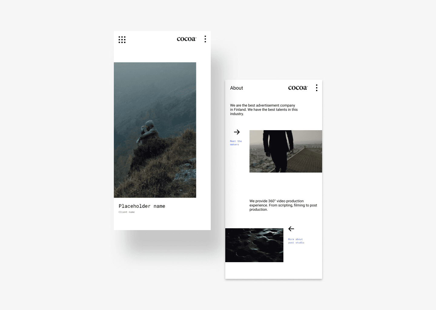
Cocoa is one of the best video production companies in Finland. Their old website was not stylish enough to represent their brand. Therefore, Cocoa would like me and another UI/UX designer, Alina, to improve their marketing web pages. The client desires to use white as the primary colour so their works could speak for themselves. Using white colour means instead of adding visual elements, we have to play with the grid and micro-interaction. Hence, the design will be subtle but still impactful.
My task
1. Co-create the mood board.
2. Information architecture.
3. Part of the desktop and mobile interfaces design.
4. Prototype.
5. Micro-interaction design

Project takeaways
1. Because the project only lasted for two weeks, we could not deliver design documentation in detail. Luckily, we decided to discuss this with the developer. He was a talented developer that could interpret the design by himself. Therefore, we didn't need to hand over any documentation. I learned that if a designer is unsure what to provide, talking with the developer is the best option.
2. If it is possible, plan tests with your users. If the resource is limited, conduct quick tests with your colleagues. We were unsure if the menu is easy to follow. After completing a few rapid tests, we understand that the structure is not perceivable by our colleagues. Therefore, we iterate the design for a better outcome.

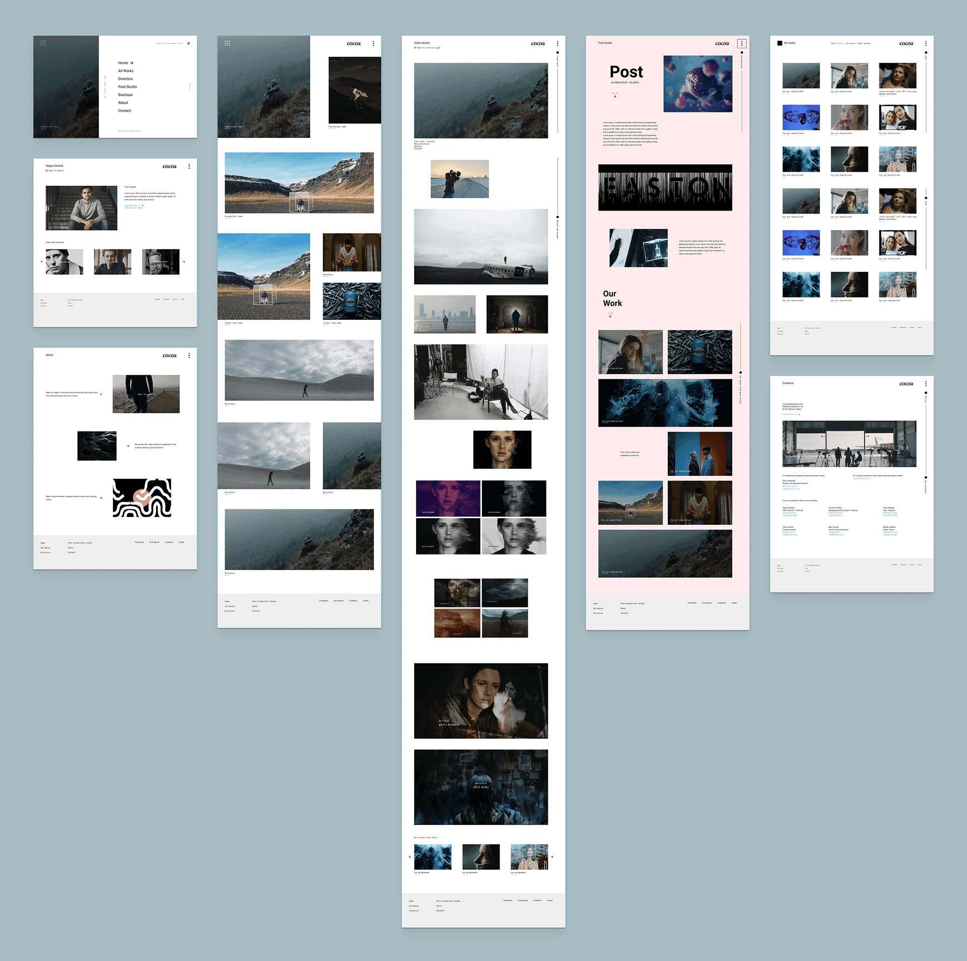
Wireframes

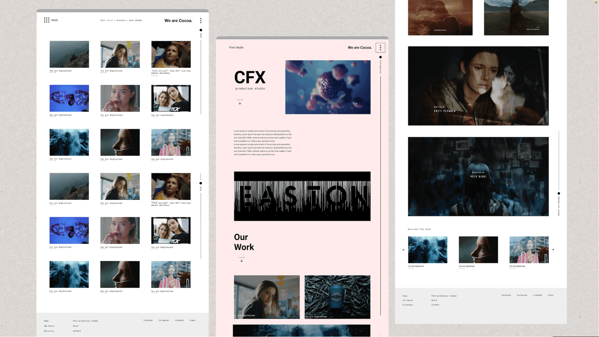
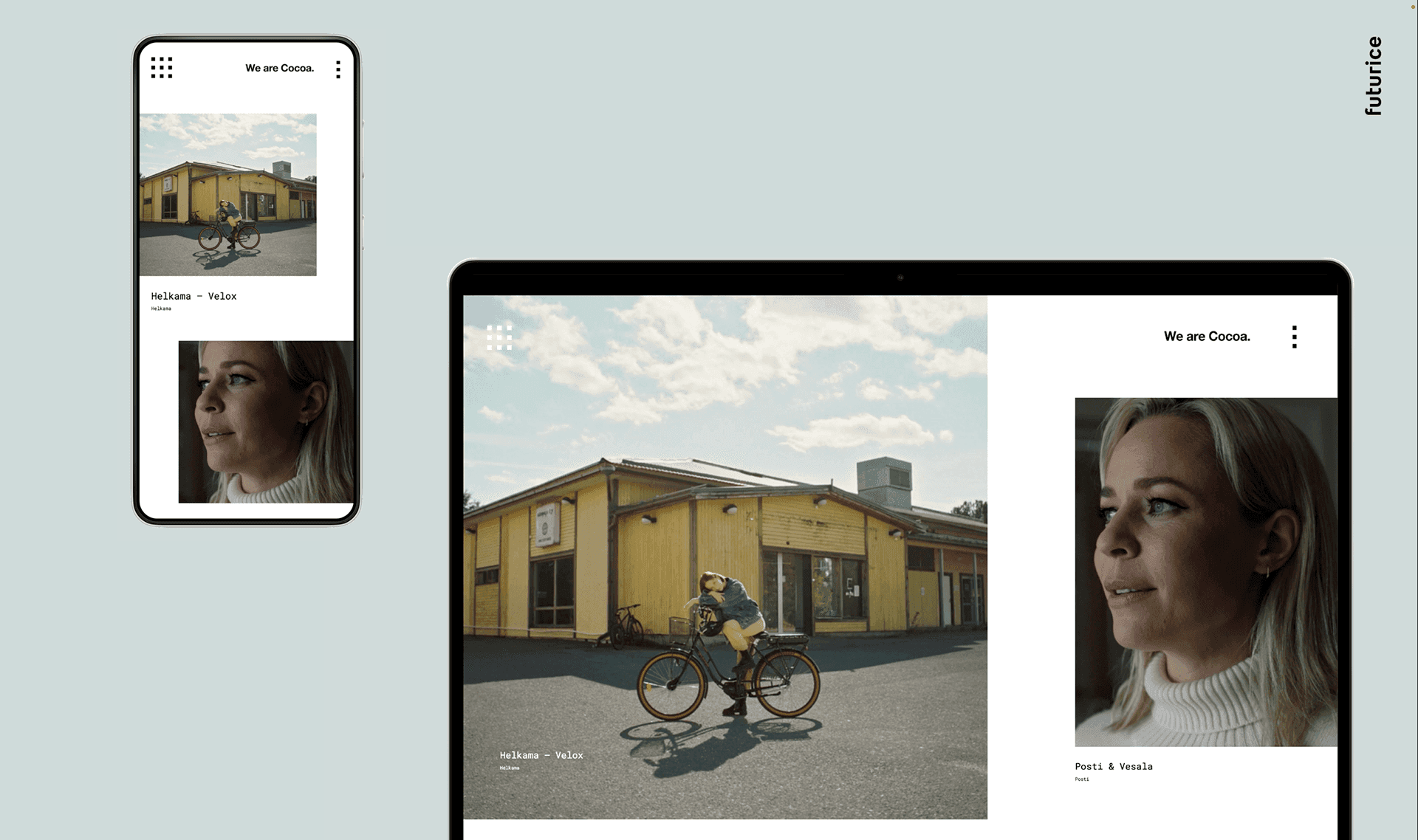
Visuals